


How to add Colour to your wardrobe
Injecting Colour into your wardrobe

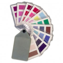
You've had your colours done. You've culled your wardrobe and now what?
In my last two blogs I mentioned the 4 deadly colours that are destroying your wardrobe and the 5 neutral colours you should have in your wardrobe.
You've removed all the wrong colours and now you're starting to build your new wardrobe.
Sometimes when clients remove the offending colours, they may find they don’t have much left to work with.
I like to think about building a wardrobe from scratch.
Lets start with the basics.

You’ve already learned about the basics to begin with once you have extracted the wrong colours.
Now you add the 5 – 7 neutrals in your colour palette.
You will have learned about those at your colour consultation.
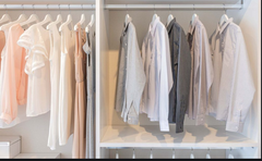
I think the best way to build a wardrobe is to start with an empty closet.
Add all your neutrals that you salvaged from the cull.
You definitely can have a wardrobe built on neutrals only, but that is not what you are looking for ultimately. We want a colourful wardrobe.
Now to add some colour.
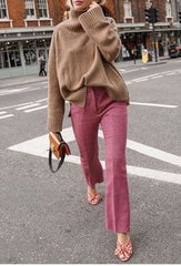
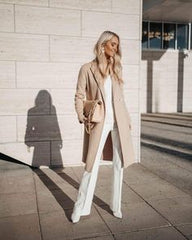
You’re neutrals are your whites, browns, beiges, taupes, burgundy's, navys, greys, denims.
You can see with just these colours, there is a lot of variety already.
Now you’re going to think about injecting the colour.
Remember neutrals go with neutrals for example you can wear denim pants with a burgundy top.
Various beiges and taupes go beautifully together. You can throw in a bit of grey with the taupes as well, remembering to always stick to your palette.
Navy’s and whites or greys are great. Denim always is a great starter for any outfit and know that denim on denim is always stylish.
Play around with your neutrals and create as many outfits as you possibly can with just the neutrals.
Taking shots of these outfits and even creating pinterest boards can be a lot of fun as well.
So when you go to make some more colourful outfits, it is easier to start with your neutrals first.
The best outfits are the ones that have only your colours in them. So don't be tempted to stray into the other seasonal palettes.
For example if you have white or denim jeans, every other colour in your palette will go. Imaging yellow and denim, white and green, white and yellow, beige and pink, grey and lemon, grey and green. The possibilities are endless because you have thousands and thousands of shades of colour to choose from.
Now you have predictably made some stylish looks you can think a little out of the box by using 2 colours that are not a basic or a neutral shade.
This may take a little more boldness, but the outfits will still look fashionable and beautiful.
Imagine 2 colours together


Imagine green and pink, lemon and green, blue and yellow, mauve and pink, red and pink, red and green, mauve and green, lilac and lemon, light blue and green. The possibilities are endless as well as beautiful.
It is true that switching to your colours completely does take some effort. But the effort is well worth it.
If you have any more questions contact Your Colours and style Sydney


