
Culling your make up
Time to cull your make up

How’s your make up stash? Have you a box full or multiple drawers of make up? Have you been collecting since the 80’s or are you someone that has a very small amount of make up?
Make up is like clothes
Make up is like clothes. You can only wear so much. If you have been hoarding the stuff for years, there will be drawers full of unhygienic matter, so maybe it’s time to cull.
Being organized and only carrying the right amount of anything is just a good idea, one that becomes more appealing to me as I grow older. So let’s get busy and cull our make up and get sorted in the make up department.
Ideally our make up should be a neat little package of the current cosmetics that are totally suited to us. Whenever I see my clients for a make up session or a personal stylist session, I always ask them to bring all their make up along. That way we can determine together what is and what isn't helpful for them to wear.
What to throw away
The very first thing that must go is make up in the wrong colours. So many women say they have trouble getting the right foundation for example. So we find a foundation that’s perfect for them. It really is no use wearing the wrong make up just because you spent money on it.
Eyeshadows, lipsticks and blushes in the wrong colours have to go as well.
Black mascara and the wrong colour kohl pencils are not good to keep.
Any make up that’s over 2 years old, most definitely should be tossed out.
It will probably be going off.
They say we should even replace our mascara every 6 months. Putting the wand in and out and applying to our lashes can introduce little germs.
Old brushes are best to be replaced and brushes, make up bags and containers need a regular clean.
What make up do we need?
Make up of course is individual. Some women love make up and are very good at applying it and other women are completely lost when it comes to wearing make up.
As an Image consultant, my view is mature women need make up to cover aging signs and define those fading features, like brows and lips. We can have a more youthful look just by wearing our make up well.

Before and after-Make up in the right colours
Make up essentials.
Here is a little list of the make up basics that after the original outlay will not break the bank, because you’ll use every drop of each product.
- Foundation-A great place to start. In the right colour of course, the right foundation can make you look years younger. YCS Cosmetics has foundation for ALL skin tones. It’s then just about choosing the formula you love to wear.

2. Concealer A must product for older clients as it hides the dark and aged skin tone. Also doubles as a lovely eye base as well. I use the #104 on all my clients.

3. Eyeshadows.Choose 1-5 in light, medium and darker shades in your colour palette of course. Mix and match and create your own eyeshadow look.

4. Kohl pencils 1 or 2 in your colours are ample. Use for tight lines, highlighting lids etc

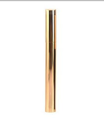
5. Brown mascara. Is a must for mature eyes. So much softer and more appealing.


6. Lip pencils. Mature lips need to be defined and no better way than a lip pencil. A couple in darker shades and lighter shades to highlight your lipstick colours. You can also use lip pencils to create lots of lip colour ideas.

7. Lipsticks. My favourite so have as many as you like in your colours. Great for lip condition and YCS lipsticks are chock full of essential oils.

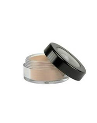
8. Powder-Powder is optional so go for a translucent powder or a neutral wet and dry powder to seal your foundation, remove shine or just act as a foundation on it’s own.


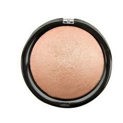
9. Blush or rose gold bronzer in your colours to lift cheeks, define and shine. It looks beautiful.


10 Brow kit. Our brows need colour and definition. They thin and go grey, so a brow kit does wonders.

These are go anywhere, suit every make up solution.
If you would like a free make up session contact your colours and style. Or see our great hands on make up classes.

Five ways to know if you're wearing your Colours.
Getting your Colours right is just so important to your Ultimate Image so read today's blog with 5 ways to tell if you do have them right or not.

How to wear your neutrals
How to wear your neutrals

What is a neutral colour?
I would describe a neutral colour as one that is quite benign. One that's not screaming for attention, and one that's a base for all of your other amazing colours.
Not everyone feels good in a pink and green outfit for example but they may enjoy wearing perhaps a green top with a neutral like grey.
It's good to start your wardrobe with your neutrals then add your colour in next.
But are all neutrals created equal? Definitely not. Many stylists are firm about having a base of dark cool neutrals like black, pure white, greys and navy’s with a splash of brown thrown in. But those neutrals are only found in the Winter Palette. Black doesn't go with everything, as we've been led to believe. And Winter neutrals don't go with Summer, Spring or Autumn neutrals.
As a colour consultant of 20 years, I have found these ideas to be quiet damaging as a whole to the fashion industry. Using black as a style staple is not useful to your Image picture.

Here's an example of working with a warm Autumn neutral and Black a cool dominant neutral to create a mismatched look.
YOU NEED TO FIND YOUR COLOURS AND THEN WORK WITH THE NEUTRALS IN YOUR PALETTE ONLY
For a stylish, complete, co-ordinated wardrobe that suits you down to the ground, you need to work with YOUR neutrals only.
The reason being, neutrals from another palette will not look good on you, and also will not go with the other shades or neutrals in your palette.
THE NEUTRAL COLOUR PALETTES.
Some stylists categorize people as neutrals. But I like to call only colours neutral not people.
Every colour is either a Cool Deep or dominant colour,(Winter) a cool muted colour,(Summer) a deep warm colour (Autumn) or a warm bright colour (Spring)
That's it. Every colour on the planet will slot into one of four palettes only. And you will be one of the four palettes as well. No sub colours or flow people in my opinion. Some colours "flow"but not people.

THE COLOUR SWATCH BOOKS FOR THE FOUR SEASONS
Get your colours right. There is Spring, Summer, Autumn or Winter. What season are you and there is no need for any sub seasons.
You will have thousands of colours to choose from that will all look amazing on you.
So what are the four types of neutrals I’m speaking of?
Warm Deep or Autumn neutrals are lovely deep olive greens, rich creams, clays, golden browns, deep apricots, muddied burgundies and pumpkins to name a few as well as rich warm khakis and golds.

The bright Spring neutrals on the other hand are still warm but much lighter than their deep counterparts, so colours like light soft caramels, light creams, warm light browns, tans, peaches and apricots are part of the Spring neutrals.

Moving into the cooler palettes we have the boldness and clarity of the deep Winter colours, black, pure white, all greys, silvers, dark navys and deep deep browns.
Forget burgundy as some may include in the Winter palette. I reserve that for the muted cool neutrals of Summer. The denim which is a winter denim is dark navy blue.

Summer neutrals are cool and soft and muted. Ones like off whites, soft grey, cool taupes, cool beiges, light cool khakis, burgundy and maroons create a nice base and don’t forget your dusty navy’s. Please don’t forget light denim teams best with these colours.

With all this in mind you can see there is a plethora of colours, considered to be neutral.
So once you know your colours, you can stick to the neutrals within your season for best results. Ask your consultant how to incorporate these into your wardrobe.
It’s always best to get professional advice about your colours and be sure the colours actually “fit”with you.
If your not happy with your results after a colour analysis, my advice would be to get a 2nd and sometimes even a 3rd opinion until you get your colours right.
I have had so many clients over the years who have had their colours done incorrectly.
There is a mindfield of systems now so I hope you find a solution that’s right for you.
HOW TO TELL IF YOU HAVE THE RIGHT COLOURS?
Here are a few checkpoints.
You'll look younger and more attractive in your colours
Your hair colour will compliment your colours
3. Your make up will blend into your skin and not sit on top
4. You will have 100’s and 100’s of colours to choose from
5. You will feel at peace in your colours
6. All the clothes in your wardrobe will coordinate
7. You will have heaps of outfits even if you have a small wardrobe (capsule)
8. You’ll always get compliments about what your wearing
9. You'll find it easier to accessorize and mix and match
You’ll look very stylish all the time.
For more information contact Your Colours and Style Sydney


