
Your Wedding Colours
How to create your wedding with the right colours
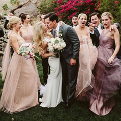
Your wedding will be aesthetically beautiful if you harmonize the whole day around certain colours.
Look at any wedding photo album and note the images that are professional to look at are those with the right colour scheme.
It's all about colour
Colour is the key to every image success. Photographers look for light and they look for good colour composition when they create beautiful images.
There are over 2.5 million colours to choose from or more. It's not difficult to choose the wrong colours, so how will you find the right colours for your bridal shots?
Consider colour for the following things-brides outfit, the mother of the bride or groom, the bridal party, shoes, hair colour, make up colours, venue colours and even photographic backdrops.
You can see how so many colours can be in the mix, so here are a few colour tips that will make all the other choices much easier and alleviate some of the stressful decision you need to make.
The brides colours
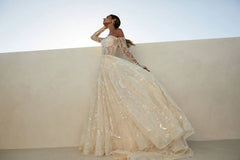
Traditionally bridal colours are softer and more feminine. It's a good look when you're getting married.
You don't want to look back in a few years time and be shocked by some outrageous fashion choices you made.
I'm pleased to see most bridal houses are holding colours like ivory, champagne, beige, silver, silver pinks, rose and soft golds as well as soft pinks and blues to name the most popular tones.
Bridal make up colours

My recommendation for all my brides would be to wear colours that tone into your skin and look soft and natural
Heavy make up, dark eyes, overly shimmery eyes and cheeks and thick unnatural lashes are worn by young women today but this is a fashion that does not look natural and in my opinion very attractive either.
You want a look that is evergreen and proud to be seen for decades to come.
Mother of the bride colours
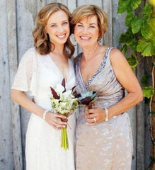
Inkeeping with the bride, mothers can stay on the softer tones theme.
These colours will flatter mature women and give her a more youthful appearance.
Aside from having a colour analysis here are a few ideas. Stick with colours like soft taupes, champagnes, rose gold, soft gold, soft pinks and blues, just to name a few. A professional colour and style analysis will explore all your colour and style choices, so it's a great investment not only for the wedding but for the future as well, if you're one to like to look stylish and ageless.
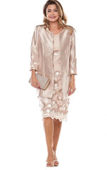
My Mother of the bride choice is this rose gold dress and shoes and I'll match the jacket in similar tones but with a more structured style than the jacket image here. Perhaps longer sleeves and a thin lapel

Mother of the bride hair
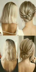
Interestingly enough, wearing the right hair colour can make all the difference to how you will look.
A simple tip is darker hair tones look great lightened a little and blonde tones need to look natural. Sometimes that requires blondes to go a shade darker.
Refer to your colour chart for the optimal hair colours for you.
Bridal floral colours
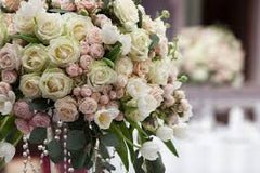
Flowers come in a plethora of shades. Some are dominant colours, some are muted and some have a slightly warm tinge. Find flowers that blend into the colour scheme. Flowers arrangements can also look formal or casual so choose flower shapes that compliment your outfits. Usually softer petals look quiet formal.
Colours for the bridal venue
You're venue will ask you for your colour scheme and it's another opportunity to keep the colour theme going.
For example if you're wearing soft beiges and ivory colours, you will want to avoid dominant colours like black and white and primary red for your table settings. Think about colour for everything.
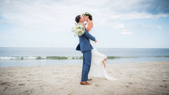
Finally ask the photographer to take photos in the areas that are more natural as well, like the ocean and green spaces. These colours are natural and go beautifully with images of people.
For more information about your colours and style contact Your Colours and Style

Five ways to know if you're wearing your Colours.
Getting your Colours right is just so important to your Ultimate Image so read today's blog with 5 ways to tell if you do have them right or not.

How to wear your neutrals
How to wear your neutrals

What is a neutral colour?
I would describe a neutral colour as one that is quite benign. One that's not screaming for attention, and one that's a base for all of your other amazing colours.
Not everyone feels good in a pink and green outfit for example but they may enjoy wearing perhaps a green top with a neutral like grey.
It's good to start your wardrobe with your neutrals then add your colour in next.
But are all neutrals created equal? Definitely not. Many stylists are firm about having a base of dark cool neutrals like black, pure white, greys and navy’s with a splash of brown thrown in. But those neutrals are only found in the Winter Palette. Black doesn't go with everything, as we've been led to believe. And Winter neutrals don't go with Summer, Spring or Autumn neutrals.
As a colour consultant of 20 years, I have found these ideas to be quiet damaging as a whole to the fashion industry. Using black as a style staple is not useful to your Image picture.

Here's an example of working with a warm Autumn neutral and Black a cool dominant neutral to create a mismatched look.
YOU NEED TO FIND YOUR COLOURS AND THEN WORK WITH THE NEUTRALS IN YOUR PALETTE ONLY
For a stylish, complete, co-ordinated wardrobe that suits you down to the ground, you need to work with YOUR neutrals only.
The reason being, neutrals from another palette will not look good on you, and also will not go with the other shades or neutrals in your palette.
THE NEUTRAL COLOUR PALETTES.
Some stylists categorize people as neutrals. But I like to call only colours neutral not people.
Every colour is either a Cool Deep or dominant colour,(Winter) a cool muted colour,(Summer) a deep warm colour (Autumn) or a warm bright colour (Spring)
That's it. Every colour on the planet will slot into one of four palettes only. And you will be one of the four palettes as well. No sub colours or flow people in my opinion. Some colours "flow"but not people.

THE COLOUR SWATCH BOOKS FOR THE FOUR SEASONS
Get your colours right. There is Spring, Summer, Autumn or Winter. What season are you and there is no need for any sub seasons.
You will have thousands of colours to choose from that will all look amazing on you.
So what are the four types of neutrals I’m speaking of?
Warm Deep or Autumn neutrals are lovely deep olive greens, rich creams, clays, golden browns, deep apricots, muddied burgundies and pumpkins to name a few as well as rich warm khakis and golds.

The bright Spring neutrals on the other hand are still warm but much lighter than their deep counterparts, so colours like light soft caramels, light creams, warm light browns, tans, peaches and apricots are part of the Spring neutrals.

Moving into the cooler palettes we have the boldness and clarity of the deep Winter colours, black, pure white, all greys, silvers, dark navys and deep deep browns.
Forget burgundy as some may include in the Winter palette. I reserve that for the muted cool neutrals of Summer. The denim which is a winter denim is dark navy blue.

Summer neutrals are cool and soft and muted. Ones like off whites, soft grey, cool taupes, cool beiges, light cool khakis, burgundy and maroons create a nice base and don’t forget your dusty navy’s. Please don’t forget light denim teams best with these colours.

With all this in mind you can see there is a plethora of colours, considered to be neutral.
So once you know your colours, you can stick to the neutrals within your season for best results. Ask your consultant how to incorporate these into your wardrobe.
It’s always best to get professional advice about your colours and be sure the colours actually “fit”with you.
If your not happy with your results after a colour analysis, my advice would be to get a 2nd and sometimes even a 3rd opinion until you get your colours right.
I have had so many clients over the years who have had their colours done incorrectly.
There is a mindfield of systems now so I hope you find a solution that’s right for you.
HOW TO TELL IF YOU HAVE THE RIGHT COLOURS?
Here are a few checkpoints.
You'll look younger and more attractive in your colours
Your hair colour will compliment your colours
3. Your make up will blend into your skin and not sit on top
4. You will have 100’s and 100’s of colours to choose from
5. You will feel at peace in your colours
6. All the clothes in your wardrobe will coordinate
7. You will have heaps of outfits even if you have a small wardrobe (capsule)
8. You’ll always get compliments about what your wearing
9. You'll find it easier to accessorize and mix and match
You’ll look very stylish all the time.
For more information contact Your Colours and Style Sydney

