Left Continue shopping
Your Order

You have no items in your cart

You might like
Product
$10.00
Add to cart
Currency
An Accurate Colour analysis

An Accurate Colour analysis

What’s all the fuss about colour?

Accurate Colour analysis

Colours is making a big time Comeback and I’m all for it, because colour is the key to our Image Success.

I mean who doesn’t want to look younger, more vibrant, more attractive, more stylish and chic?

It’s a no brainer when it comes to fashion, colour can quickly transform your appearance.

So what’s all the fuss about and why are so many stylists and of course colour consultants and Image Consultants, hopping on the colour bandwagon?

Colour is so exciting.

Grace Kelly in her colours

I do think the most elegant, beautiful and stunning women know how to dress in their colours.

Think of the stars of the 50’s in those amazing gowns and extravagant wear, looking absolutely breathtaking in their gorgeous colours.

Colour is not only the most exciting way to dress but also the most individual way to dress.

Wearing your colours will make you not only more beautiful and stylish, but more creative as you learn how to use your colours well and create great colour combos and accessorise in an interesting manner.

How does a colour analysis work?

Colour analysis drapes

As a colour consultant the first thing I explain to my clients when having their colour analysis is what to look for in the draping.

Wrong colours highlight shadow, lines, dullness, redness, pigmentation and other flaws in the skin. They make our teeth look more yellow, the whites of the eyes not as white and our hair duller.

The correct colours even out the skin. They bring brightness, less shadow, lines and wrinkles.

Pigmentation, redness and aging are all less noticeable in the right colours. Our teeth look whiter, our hair looks brighter, when we wear our colours.

It’s really good to learn how to “read” your colours as you’re draped and a trained colour consultant should be able to point these things out to you.

This understanding helps immensely then when you’re shopping on your own with your own seasonal colour swatch.

Have a colour analysis

Colour analysis


The first thing to do to learn about your colours is to have a colour analysis.

This can be done online or in person

It’s just a simple 15 minute process that will change your Image world and transform your look overnight.

The consultant starts with a warm (coral) drape and then a cool (pink) drape to show the client how warm and cool reflects on their skin.

At this stage it should be obvious to the consultant, who informs their client, what each shade is doing and how it shows on the skin.

You have draped the warm and the cool and then you will go on to drape 4 red, blue, green, yellow and white colours in each season.

One of each, Spring, Summer, Autumn and Winter drapes are only necessary as every colour belongs in only 1 of 4 palettes.

The analysis uses colour groups from the 4 seasons.

Every colour has a value of either Cool Dominant which is classified in the Winter range of colours.

The Summer colours are classified as cool (blue based) muted colours

Autumn shades are yellow or red based warm strong colours.

Spring shades are warm also and yellow based but are much lighter than the Autumn colours and often appear brighter than the Summer shades.

Every single one of the infinite number of colours can be placed into 1 of these four categories.

This is the best place to start with colours.

Every client fits into only ONE of these categories.

It is impossible to be able to suit warm and cool colours at the same time.

Colours are warm and cool and neutral, not people. This is where some confusion has crept into the colour world.

Another confusion is when certain colours are placed into the wrong category of colours, so best to find a consultant that is experienced with working with colours.

If you have for example one of every green, 1 spring, 1 summer, 1 winter and 1 autumn green as you drape the consultant will be able to see just how each colour reflects upon your skin.

As they drape you with each colour component eg. All the reds, yellows, reds and blues, a pattern should form as in the same season will appear as the most flattering.

Everything in the draping should agree so that you can see that only ONE season comes up as the best season for you.

What a colour analysis is not.

Vein test for colours

In the past we have been told to determine your colours by your veins, or your hair or eye colour.

This is not an accurate way of telling your colours and should be avoided as a guide.

The hair needs to be covered and the drapes are accessed by your UNDER skin tone.

It can become very confusing, so I would suggest you find a good colour consultant with lots of experience and good reviews.

If you would like more information about having your colours done and having an accurate colour analysis please contact your colours and style.

Comments

Thanks Jenni please contact me via email for details. Thanks Ros

Hi, wondering if you would be able to do colour analysis for a group of women on a weekend away at Whale Beach? Thanks Jenni

Leave a comment

Please note: comments must be approved before they are published.

5 Top Colours for your Winter Wardrobe

5 Top Colours for your Winter Wardrobe

Your 5 top staple colours for Winter

THE 5 DEADLY COLOURS KILLING YOUR WARDROBE

Last blog I spoke about the 5 deadly colours that are killing your wardrobe.

Well it wouldn’t be fair if I didn’t tell you, at least 5 top colours to replace the ones you ousted.

These colours are not only to replace the one’s you’ve lost but they actually are what I call your neutral basics.

MANY STYLISTS WILL BUILD YOUR WARDOBE BASED ON BLACK

Many stylist will build your wardrobe from top to toe, using colours like black, white, grey and navy.

Some may consider these colours to be your staples but at your colours and style, as a colour consultant for over 20 years I have a different approach to colour, that works so well not only for all people but the difference will be noted more by the mature.

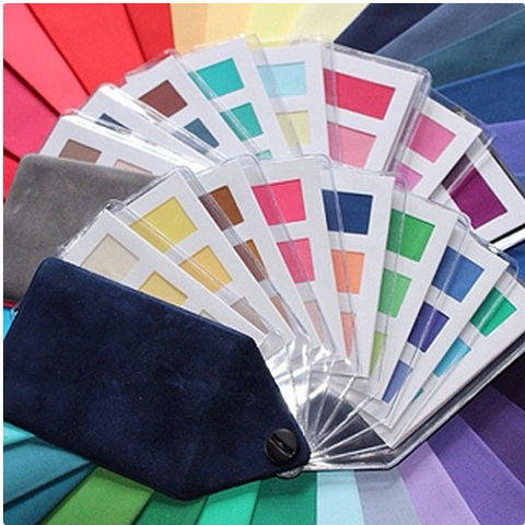
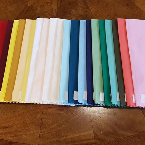
5 TOP STAPLE COLOURS

So here are the 5 top staple colours to build your wardrobe , I am recommending for you.

In fact you can just about create a really nice capsule wardrobe with these colours alone.

Staple colour no 1. Off white

Have you noticed some whites are too stark, some are too dull, but the off white tones (there are too many to count) are just right?

So imagine off white jeans, off white pants, off white jackets, coats and cardigans, off white shoes and boots, off white T shirts and sneakers. Off white is always a beautiful and chic option. You can never go wrong.

Staple colour no 2. Light denim

Have you ever considered dark denim to be just a little strong? And when a colour is too strong for you, it’s just plain wrong?

Light denim always looks more stylish and attractive and teams so well with all your other colours.

Light blue jeans, chambray shirts, denim jackets. Denim is always in fashion and can offer casual as well as classic looks.

Staple Colour no 3. Taupe

What is taupe? It’s sort of a very light brown. There are lighter and darker shades of taupe as well as warm taupes. Taupe is a very classy colour and just like all of your other neutrals can mix with all your neutrals. For a look that says “calm” try taupe for a welcome change.

Staple Colour No 4. Dusty Blue

Dusty Blue is lighter and softer than the strong dark royal blues, regal blues, navy blues, ink blues, electric blues, teal blues etc.

You will find this colour more soothing to the eye and just gorgeous and always classic and fashionable. Shop around it’s worth waiting for the right find to add to your wardrobe and don’t just settle for the wrong blues it’s not worth the compromise.

Staple Colour No 5 Burgundy

Burgundy has always been a rich and royal option to any wardrobe. Although it’s a very strong and somewhat heavy colour, it still gives the appearance of softness and is less harsh than black and the deeper dominant colours.

You will always get compliments when you choose to wear Burgundies, Berrys, Plums and similar tones.

So there you have 5 winners for your wardrobe. Remember there are many many versions of those 5 colours I’ve just listed , so consider the scope of shades that come in just those 5 colours. For example imagine a top to toe monochromatic look in various taupes.

For more information about your colours or how to get your colours done

Contact Your Colours and style Sydney


Read more
4 of the deadliest Colours in your wardrobe

4 of the deadliest Colours in your wardrobe

The 4 Colours that are destroying your wardrobe

Get these 4 colours out of your wardrobe now if you’re interested in looking your best and having a functional and stylish wardrobe. 

It's these 4 colours that are setting your style up to fail especially as you age. 

A powerful style secret

As a professional colour consultant for over 20 years, I've witnessed over and over again, what is destroying fashion for women, especially mature women. 

Have you noticed the older you get, certain colours are aging you as well as making you look drab and dull? 

I’m going to share with you a very powerful secret that will save your wardrobe, your style and even your purse.

For years we have been consumed with the idea of finding out what colours suit us, but despite all the fuss, many have been deceived about the colours that suit them. 

Many stylists are avoiding colour rules and are putting style before colour. This is quiet the wrong way around as colour is 80% of your style equation. 

What are the 4 deadliest colours for mature women to avoid?

Deadly colour no 1.

Black

Coco Chanel did us no favours when she immortalized the LBD ( Little Black dress.)

Once that became fashion law, women all over the world adopted black as their most chic option. 

Trouble is black is the number one deadly colour in your wardrobe.

3 reasons why black is the deadliest colour in your wardrobe.

Black is a non colour.

Black absorbs all light and  has the reputation of bringing death to everything around it.

Have you noticed how dull you look when wearing black?

Have you noticed the shadow and lines on your face and neck become more prominent when you wear black?

What mood does black create? How do you feel at a funeral when everyone is in black? 

It's certainly a sad colour. 

There’s a definite heaviness in the air.

2     Black restricts your colour choices.

The misconception about black is it goes with everything. Hence we wear black pants, black coats, black bags, black shoes etc.

Black becomes the base we build our wardrobe around,

Black has a habit of reproducing itself because black doesn’t go with everything, so many people wear black from top to toe.

You may have a wardrobe full of clothes, but have nothing to wear, because black is your base colour.

Most of your outfits look drab because black is your base.

You go out to buy more clothes because your current wardrobe feels drab only to come home with more black. You try to mix black with other colours and get confused when the outfit looks uncoordinated.

    Black doesn't go with everything

As mentioned black does not go with everything.

It not only does not go with everything it stops you from choosing other multiple colours that do go with everything and do go with you.

If you don’t believe it, google any famous person and note, not only how often they wear black, but also how little colour they wear as well.

This is such a shame because most people do not utilize all their colour and unless you’ve had a proper colour analysis and have learned about all the colours that suit you, you too will be that person as well.

Deadly colour no 2.

Dark navy.

Almost all women I’ve seen over the years, fall into this deadly trap.

They know black is too dull and dark and aging so they substitute black with navy.

But they substitute black with a navy that goes with black and experience the same problems they do if they wear black.

They look dull and uninteresting in dark navy, They need to learn about the right navy's that look amazing on them instead.

Deadly Colour no 3

Dark grey

Add a bit of white to black and you get a light black, which is dark grey.

The problem with light black or dark greys' is these colours are still heavy and strong. You can find out what greys are best for you which are much more flattering. 

Deadly Colour no 4.

Dark denim

We know that denim comes in all shades from ink navy, to faded denim to bright denim blues.

The colours of denim are so varied, they can go with all and every season. The dark denim or ink blue denim is again a type of blue that goes with black also and is too strong. 

Be sure you find out the sort of denims you can wear for your wardrobe that go with all your colours and the colour denims that are flattering to you.

If you have more questions contact your colours and style.


Read more
5 things a colour analysis is not

5 things a colour analysis is not

Five things a colour analysis is not

Read more