Left Continue shopping
Your Order

You have no items in your cart

You might like
Product
$10.00
Add to cart
Currency

Blog / Colour analysis Sydney

The Four Seasonal Colour Palettes

The Four Seasonal Colour Palettes

The four Seasonal Colour Palettes

Spring                     Summer                   Autumn                    Winter

Are you confused about Colour?

If you find the seasonal colour palettes confusing, you’re not alone.

Since the 70’s the information about what colours suit you and what the colours are, has gone through many changes.

In this blog I want to outline what the four seasons are and what most colour systems are based upon.

The Four Seasons

As you may or may not know the four seasonal colour palettes are Spring, Summer, Autumn and Winter.

They are just like the four seasons in nature.The temperature value may be different though.

Winter is classified as cool

Summer is classified as cool

Spring is classified as warm

And Autumn is classified as warm. There are two warm seasons and two cool seasons.

Warm and cool Colours

A warm colour or tone is yellow or red based. A cool tone is blue or grey based. Are all blues and greys cool? No they are not. Are all yellow and red tones warm? No they are not.

This is why it’s important the colour consultant spends much time learning about the temperature of each colour. Is the colour warm or cool?

Is this easy? No this is not. The reason being there are over 16 million colours. With time and experience one can learn what category any colour belongs.

What is a Winter Colour?

The Winter Colours are Deep, Strong, Dominant. Black and pure white are the bookends with all the primary power colours featuring.

Primary, red, green, blue, yellow. Don’t forget a pure Orange, a deep Chocolate brown. The darker greys and deeper vibrant pinks are there as well. Very dark navy's, electric blues and ink navy's. 

Originally Beige featured and the icy pale versions of colour, were in the Winter Colours, but I question their right to belong.

What is a Summer Colour?

Summer Colours are cool as well as the winter colours, but are much more muted and subtle than their deeper counterparts.

Summer colours are pastel, muted, soft, but there is the strength of a chocolate brown and a maroon or burgundy. I like to include all cool beiges, soft cool taupes, very soft cool greys, silver and rose gold as well as grey khakis.

There is no orange in the Summer palette, but the cool corals and watermelon pinks belong very nicely.

What is a Spring Colour?

Spring colours are exactly what the season suggests. They are bright and airy. Buttercup yellows and light teals. Lots of warm caramel browns and beige's.

Bright reds with peaches and creams and apricots. Don’t forget the lime greens. Often these colours are confused with Summer Colours because of their value. But Spring Colours appear brighter and more yellow based.

Spring Colours aren’t quiet as strong as Autumn colours obviously.

What is an Autumn Colour.


Again Autumn is another Deep season, meaning these colours are very strong.

They appear to be much heavier than the Spring Colours. Deep warm Browns, olive greens, pumpkins, deep creams. Rich warm purples and deep teal blues. The yellows of the Autumn season are very orangey yellow and the reds are very bright yellow reds.

Still confused about Colour?

So if you’re still confused about your colours, don’t be. Have a personal one on one colour analysis in my studio in Ramsgate Sydney or for an accurate online analysis with lots of moving forward steps try my online colour analysis for an instant result.

Ros at Your Colours and style.  “Be beautiful in your colours”


Read more
The four Seasonal Colour Palettes

The four Seasonal Colour Palettes

Where did the colour theories begin?

Colour wheel for colour analysis

Johannes Itten (1888-1967) was a Swiss painter, designer and theorist.

He believed colour could invoke feelings, and I agree. What do you feel when you walk into a strong bold monochromatic office? How do you feel when you visit a warm old country farm enriched with the golden hues of the Autumn Palette?

What colours do you envisage would enhance a seaside apartment, and how do you feel when you are in that space?  Do you feel light, airy, fresh and happy in the shades of the Muted Summer Palette.

Then there are the bright and light colours of Spring and how do we feel at that time of the year, when we experience new growth and blossoms of the bright spring palette?

Itten theorized seven types of colour contrast, contrast by hue, value, temperature, compliments, simultaneous contrast, contrast by saturation and contrast by extension. He explained by using a colour sphere with the primary colours of red, yellow and blue.

He was the first to associate colour palettes with four types of people and labelled these with the four seasons.

What are the four seasons?

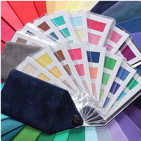
Four seasonal colour swatches

After many years the four seasons were developed in the 1950’s.

These four seasons reflect the seasons of nature. Spring, Summer, Autumn and Winter.

It was a clever way of grouping the seasonal colours as they reflect characteristics of the seasons they represent. Colours of the Winter season like the black sky, the white ice and grey days, paint a picture of dominant cool clear colours.

The soft muted colours of Summer-clear blue sky, soft yellow sand, soft green grass and the calypso colours that accompany our beautiful summer season.  

Autumn ushers in the mossy greens and the brilliant colours of autumn leaves with the burnished colours of the trees.

Finally the delightful and delicate and bright colours of Spring with the fresh green grass and spring collection of budding flowers.

In relation to people, a particular colour palette with loads of variety can be designated to each person.

How did the four seasons  become 12 or 16 seasons?

After many years, certain colour consultants deemed that 4 seasons were not enough to identify the numerous “types” of people on the planet.

This only managed to dilute and distort a perfectly functional and accurate way of doing colours.

The original stated whether you are warm or cool ie, Autumn and Spring warm or Winter or Summer cool.

Then once that is determined a further breakdown accessed if you were the deeper or lighter of that breakdown.

So simple and so straightforward was this system. The problem was colour consultants failed to “see”the colours against the clients skin, thereby giving a false reading.

Therefore needing more sub categories.

And so we now have a further diluting of each of the four seasons, calling Spring warm, light and bright. Summer cool, light and soft. Winter bright deep and cool and Autumn warm, deep and soft which is just a further explanation of what these four main categories are. It’s just a repetition of what they are.

Further confusion with the seasonal colours.

Sadly now we have thousands of interpretations of what each of these colour breakups look like.

If you search it out each colour analyst will have different colours in each palette, and in fact most have a combination of all the seasonal colour palettes included in each category, with the colours from each of the spring, summer, autumn and winter palettes.

This leads to ultimate confusion for the client and a colour palette they adhere to with a real miss mash of colours and a totally uncoordinated wardrobe.

 I see these clients after a while and they are not adhering to their palette at all because the palette may only have some of their colours and many wrong colours.

My final analysis on colour.

Stick to the four seasonal colour palettes.

Find accurate colour palettes that identify colours this way.

Winter colours are Cool, blue based, strong, primary and bold. They include black, white, all greys, Deep deep chocolate brown, extremely pale icy colours for contrast and the rich primary colours.

Summer colours are also cool, soft, muted and contain the deep colours of milk chocolate brown, beiges, taupes, soft grey, soft denims, burgundys, mint greens, soft emeralds, lemon yellows, muted pinks and purples, wedgewood blues, light blues and soft muted navys

Autumn colours are rich and deep and warm. Pumpkins and ochres and rich warm purples and golden yellows and warm golden browns and creams and teal and muted blues and rich warm burgundys as well as orange reds and all oranges.

Spring colours are similar to Summer colours and are often mistaken because they are the less intense, versions of colours, but they are much brighter due to the warm component and yellow base. You have lime greens and soft warm corals and peaches and warm browns and warm caramel browns and yellow beiges. Bright blues and bright greens and bright yellows are the happy colours of Spring.


This is just a small sampling of the colours that fit into the four palettes. All I know as an experienced colour analyst your colouring will suit one only of the four seasonal colour palettes. From there the rest is easy just start wearing ALL the many many many colours in your beautiful palette for a beautiful and colourful and co-ordinated functional wardrobe.

For more information contact Your Colours and Style.


Read more
An Accurate Colour analysis

An Accurate Colour analysis

What’s all the fuss about colour?

Accurate Colour analysis

Colours is making a big time Comeback and I’m all for it, because colour is the key to our Image Success.

I mean who doesn’t want to look younger, more vibrant, more attractive, more stylish and chic?

It’s a no brainer when it comes to fashion, colour can quickly transform your appearance.

So what’s all the fuss about and why are so many stylists and of course colour consultants and Image Consultants, hopping on the colour bandwagon?

Colour is so exciting.

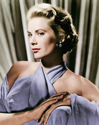
Grace Kelly in her colours

I do think the most elegant, beautiful and stunning women know how to dress in their colours.

Think of the stars of the 50’s in those amazing gowns and extravagant wear, looking absolutely breathtaking in their gorgeous colours.

Colour is not only the most exciting way to dress but also the most individual way to dress.

Wearing your colours will make you not only more beautiful and stylish, but more creative as you learn how to use your colours well and create great colour combos and accessorise in an interesting manner.

How does a colour analysis work?

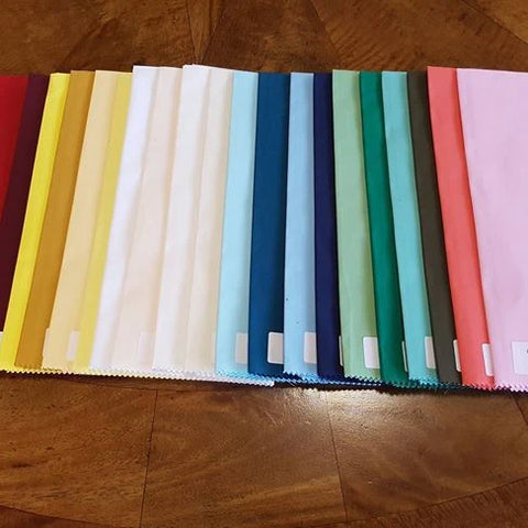
Colour analysis drapes

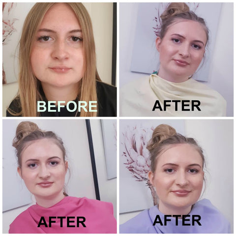
As a colour consultant the first thing I explain to my clients when having their colour analysis is what to look for in the draping.

Wrong colours highlight shadow, lines, dullness, redness, pigmentation and other flaws in the skin. They make our teeth look more yellow, the whites of the eyes not as white and our hair duller.

The correct colours even out the skin. They bring brightness, less shadow, lines and wrinkles.

Pigmentation, redness and aging are all less noticeable in the right colours. Our teeth look whiter, our hair looks brighter, when we wear our colours.

It’s really good to learn how to “read” your colours as you’re draped and a trained colour consultant should be able to point these things out to you.

This understanding helps immensely then when you’re shopping on your own with your own seasonal colour swatch.

Have a colour analysis

Colour analysis


The first thing to do to learn about your colours is to have a colour analysis.

This can be done online or in person

It’s just a simple 15 minute process that will change your Image world and transform your look overnight.

The consultant starts with a warm (coral) drape and then a cool (pink) drape to show the client how warm and cool reflects on their skin.

At this stage it should be obvious to the consultant, who informs their client, what each shade is doing and how it shows on the skin.

You have draped the warm and the cool and then you will go on to drape 4 red, blue, green, yellow and white colours in each season.

One of each, Spring, Summer, Autumn and Winter drapes are only necessary as every colour belongs in only 1 of 4 palettes.

The analysis uses colour groups from the 4 seasons.

Every colour has a value of either Cool Dominant which is classified in the Winter range of colours.

The Summer colours are classified as cool (blue based) muted colours

Autumn shades are yellow or red based warm strong colours.

Spring shades are warm also and yellow based but are much lighter than the Autumn colours and often appear brighter than the Summer shades.

Every single one of the infinite number of colours can be placed into 1 of these four categories.

This is the best place to start with colours.

Every client fits into only ONE of these categories.

It is impossible to be able to suit warm and cool colours at the same time.

Colours are warm and cool and neutral, not people. This is where some confusion has crept into the colour world.

Another confusion is when certain colours are placed into the wrong category of colours, so best to find a consultant that is experienced with working with colours.

If you have for example one of every green, 1 spring, 1 summer, 1 winter and 1 autumn green as you drape the consultant will be able to see just how each colour reflects upon your skin.

As they drape you with each colour component eg. All the reds, yellows, reds and blues, a pattern should form as in the same season will appear as the most flattering.

Everything in the draping should agree so that you can see that only ONE season comes up as the best season for you.

What a colour analysis is not.

Vein test for colours

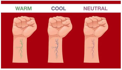
In the past we have been told to determine your colours by your veins, or your hair or eye colour.

This is not an accurate way of telling your colours and should be avoided as a guide.

The hair needs to be covered and the drapes are accessed by your UNDER skin tone.

It can become very confusing, so I would suggest you find a good colour consultant with lots of experience and good reviews.

If you would like more information about having your colours done and having an accurate colour analysis please contact your colours and style.

Read more
Your Slimmest Colours

Your Slimmest Colours

How to choose your slimmest Colours

Your Slimmest Colours

They say “you can never be too rich or too slim”. I’m not sure about that, but as a professional colour consultant I know there are certain colours that make you look slimmer.

Most mature women I know crave a more slender outline and one that doesn’t make us appear fat and frumpy, but can the colours we wear, help us to achieve that goal?

They most definitely can. So what would be your most slimming colours?

Is Black the most slimming Colour?

Is black slimming?

If you ask women what is the most slimming colour, the most outstanding answer would be black.

But is black the most slimming colour?

No it isn’t and here are 2 reasons why.

  1. Black is a non colour that sucks up all the light. There is no reflection from the colour black. This makes the colour appear dark, dull and heavy. It’s a misconception that black is light and slimming.
  2. Because black absorbs all light, the garment will have no “flow”. Flow means areas of light and shade. It appears to be completely block, again giving an“heavy” appearance.

But the misconception that black is your most slimming colour has gained lots of support. Sadly not everything you read is true.

How can colour make you slimmer?  

Slimmer colours

Is black slimming

It ‘s true colour plays a key role in helping us to look slimmer and more together. Especially when we wear our colours from top to toe.

Your colours will make you look lighter and brighter.

This works by allowing light onto the subject. The light that you need to draw to yourself. 

Wearing your colours from top to toe gives the illusion of slimness.

Without this colour cohesion an outfit can appear to look messy or sloppy.

Wearing colours from different palettes can cut the body up and also add unwanted weight to you.

Eg. If you wear a top from one colour palette and a pant from a different colour palette, you look mismatched,cut in half and that line across your middle adds "weight".

This can also happen by adding black pants to everything.

Always wear the right colours

Wearing your colours

Colour analysis

Sydney stylist

If you always wear the right colours from top to toe, you’ll look taller and therefore slimmer.

The right colours for you will also attract the right light to you as well.

How do you choose the right colours?

Now that you realize, wearing your colours can make you look so much slimmer and more co-ordinated and more stylish, how do you go about finding the colours that suit you?

There are an unlimited number of colours. Easily in excess of 16 million. That’s one of the major reasons why people find it difficult to differentiate between the right colours and the wrong colours to wear.

I would always recommend a good colour analysis from someone who has been gaining good reviews for accurate colour analysis work and preferably someone who’s been in the industry for many years.

 It’s so easy to get the colours wrong. A colour analysis literally takes less than 30 minutes. Always use the draping method and I prefer the original 4 seasons analysis from the Colour me Beautiful days.

Since then so many changes have occurred with various colour systems that can be quiet confusing.

I do know that if you practice wearing colour all the time, you have a good chance of getting your colours right over time.

Note which colours you get lots of compliments for and also the ones that make you look younger and more vibrant.

For more colour advice contact Your Colours and style.


Read more